Geodessey
Designing a level select interface
I have been redesigning the "level select" screen, previously comprised by buttons, to a map-like thing so the game feels more like an adventure the player is progressing though.
In the previous level select screen the levels where divided in sets of 20 to avoid scrolling though long screens and I decided to keep that. However dividing the 60 planned levels the same way would leave me with only 3 locations in the map and a pretty big secondary screen or side panel full of buttons. That is why each set of levels contains only 5 now.
With this in mind, the requirements for the screen were:
- Display level groups as nodes connected though a path in some sort of landscape.
- Display buttons for each level within a level group (5 levels per group), again each level can be locked or unlocked.
- Display high scores for the selected level.
- "Back button" and "play level" button.
And this was my first draft:
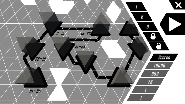
However, this is not very pleasant to the eye. What is wrong?
- Too much contrast everywhere. Since I decided that most screens would be grayscale, contrast is the only way I have to make things pop up. This means saving high contrast only for selected or interactable elements.
- Flat colors are pretty boring. I am going to try to use "fog" as a way to add volume and interesting gradients of grey, like I did in the menu and game backgrounds, making the map also look similar to those screens and thus be more integrated in the game. Giving transparency to the side menu's background will help fix this flat color issue too.
- The distribution of the gui elements isn't too harmonic either, though this is more subjective. I think I'm going to try to solve this by trial and error.
After addressing those problems, this is how the screen looks like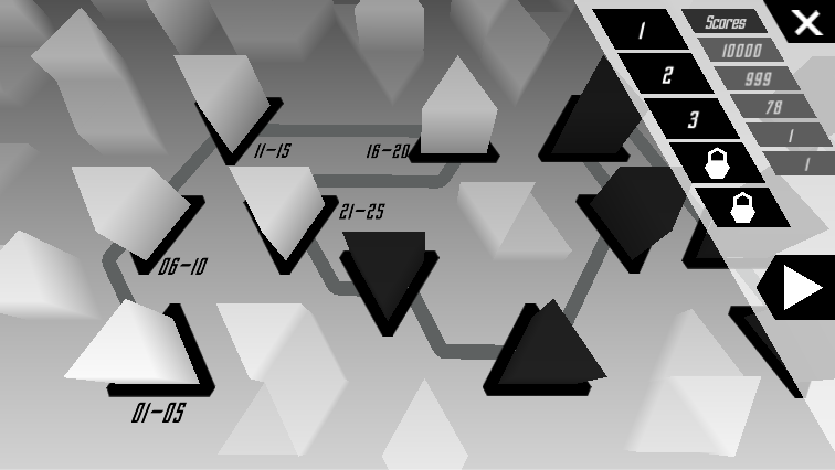
Leave a comment
Log in with itch.io to leave a comment.